Luxury branding for a cosmetics brand that combines the power of natural ingredients with the precision of modern skincare
L’AVES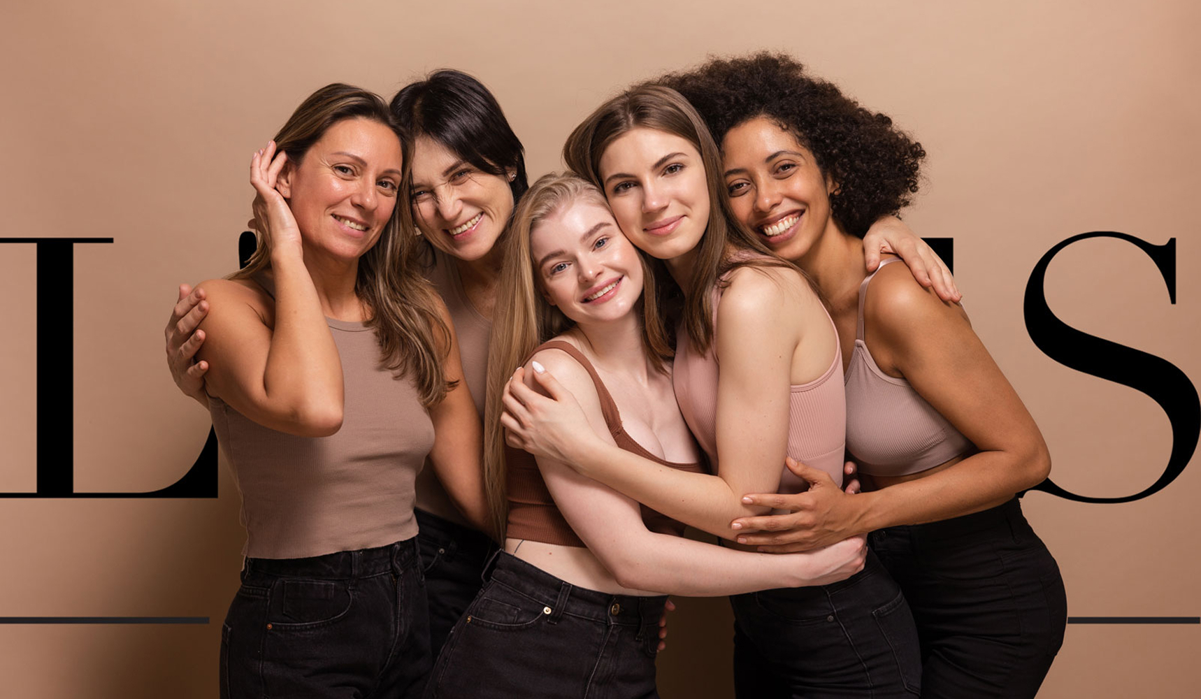
Brand identity
Website
logo
Context
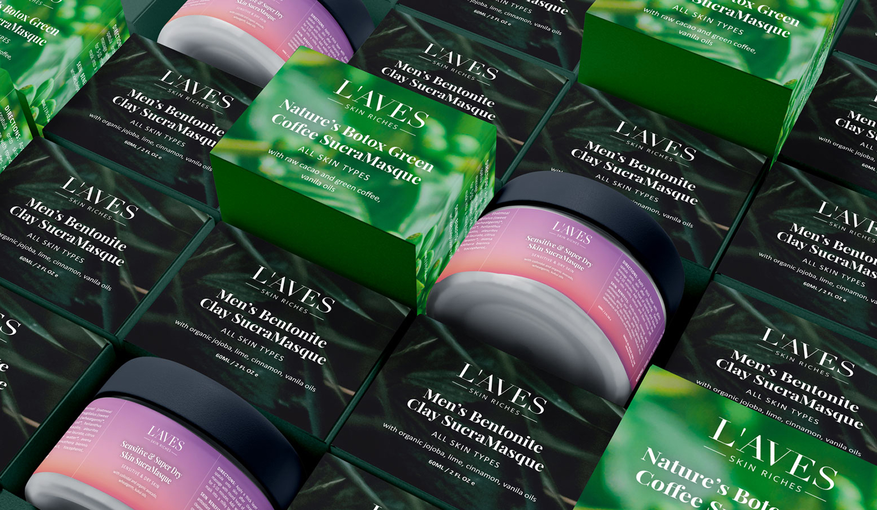
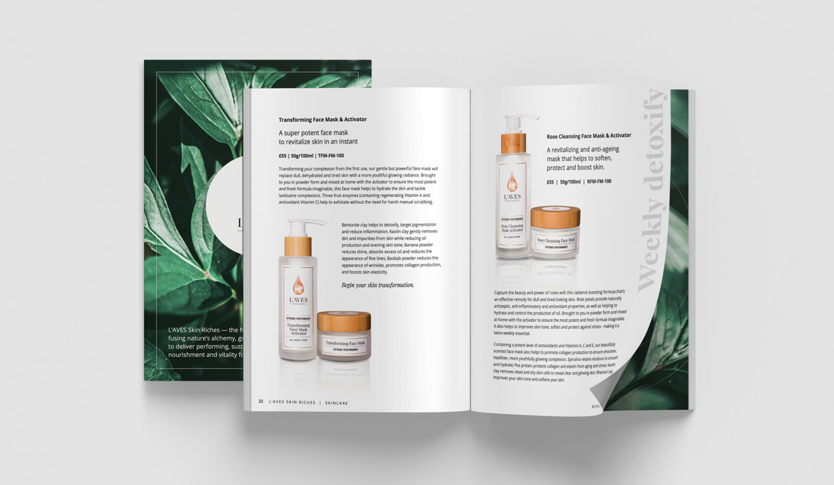
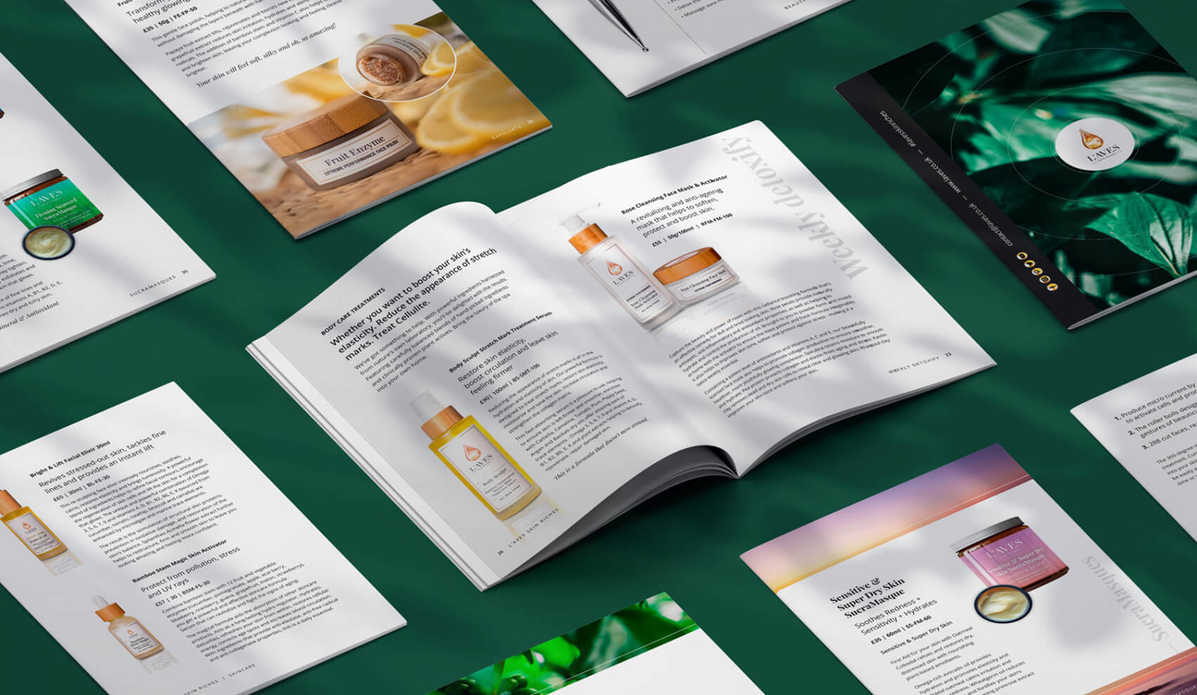
L’AVES is a natural skincare brand built on biologically active formulas, antioxidants, nutrients and vitamins derived from plants that have been known for thousands of years. Its philosophy combines an innovative approach to skincare with respect for nature, the environment and cruelty-free products. Studio Contrast was responsible for the logotype, visual identity, product packaging, promotional materials and a dedicated website.
Challenge
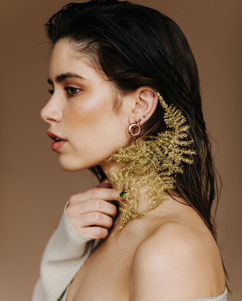
The brand needed an image that would combine naturalness with a sense of luxury. The challenge was to avoid both an overly ‘green’, generic eco aesthetic and a cold kind of premium detached from the brand’s values. L’AVES had to come across as clear, professional and trustworthy, yet also warm, sensual and close to the conscious customer looking for quality, effectiveness and an ethical approach to skincare.
Strategy
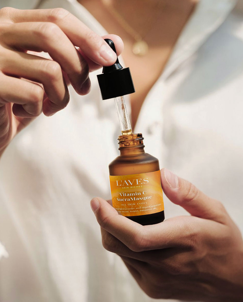
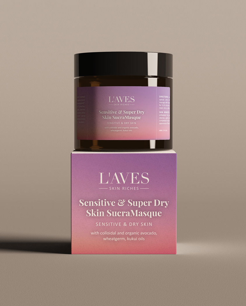
The visual direction was built on refined simplicity, a subtle colour palette and details that create a sense of quality. Minimalist labels with rose-gold lines add elegance to the products, while bamboo elements bring natural warmth and a more organic feel. Everything was designed to showcase the brand’s innovative formula without losing its ecological values. The identity, packaging, promotional materials and website form a coherent brand world – modern, natural and luxurious without being over the top.
Outcome
The result is a complete look for a skincare brand: from the logo and identity, through packaging, to promotional materials and the website. L’AVES gained an elegant, clear and trustworthy image that communicates both the effectiveness of its products and their natural origins. The brand looks premium but not cold; eco-friendly but not predictable. It’s a visual system that builds closeness with customers and increases the perceived value of the products.