Businesses that understand the difference build brands people remember. Businesses that don’t commission a new logo every few years and wonder why nothing ever changes.
Brand strategy — what has to exist before anything is designed
Professional branding starts with questions, not sketches.
Who is your client? Not ‘everyone’ — who, specifically? What problem do you solve? How are you different from competitors who seem to do the same thing? How do you want to be perceived — and how are you perceived now? What level do you want to communicate?
These aren’t philosophical questions. They’re decision-making questions. The answers determine whether the logo should be minimalist or richly detailed, whether the colours should be cool and calm or warm and energetic, whether the typography should feel expert or approachable, and whether the tone should be formal or personal.
Without that layer, a designer is working in a vacuum. They might create something beautiful. But beautiful for whom? And why?
Logo, colour, typography — the triangle that shapes how a business is perceived
A good logo is legible at any size, works in black and white, and looks right on a website, a business card, an email signature and a billboard. It doesn’t have to tell the company’s mission in a single symbol. If you try to fit your values, a metaphor for growth and a nod to the founder into one logo, it’ll get crowded. And crowded doesn’t look premium.
Colour isn’t aesthetics. It’s communication. It builds associations, organises the information hierarchy and makes a brand stand out visually. What matters isn’t just the main palette but the rules: where to use each colour and where not to, what pairs with what, and how it behaves on a dark background.
Typography is the element most businesses ignore — and the one that makes a huge difference. Fonts have a voice. An elegant serif speaks differently from a technical sans serif. A bold geometric sans speaks differently from a classic humanist face. Well-chosen typography means every piece of text — an email, a proposal, a LinkedIn post — sounds like the same brand.
Templates, the brand book and the elements that make the system actually work
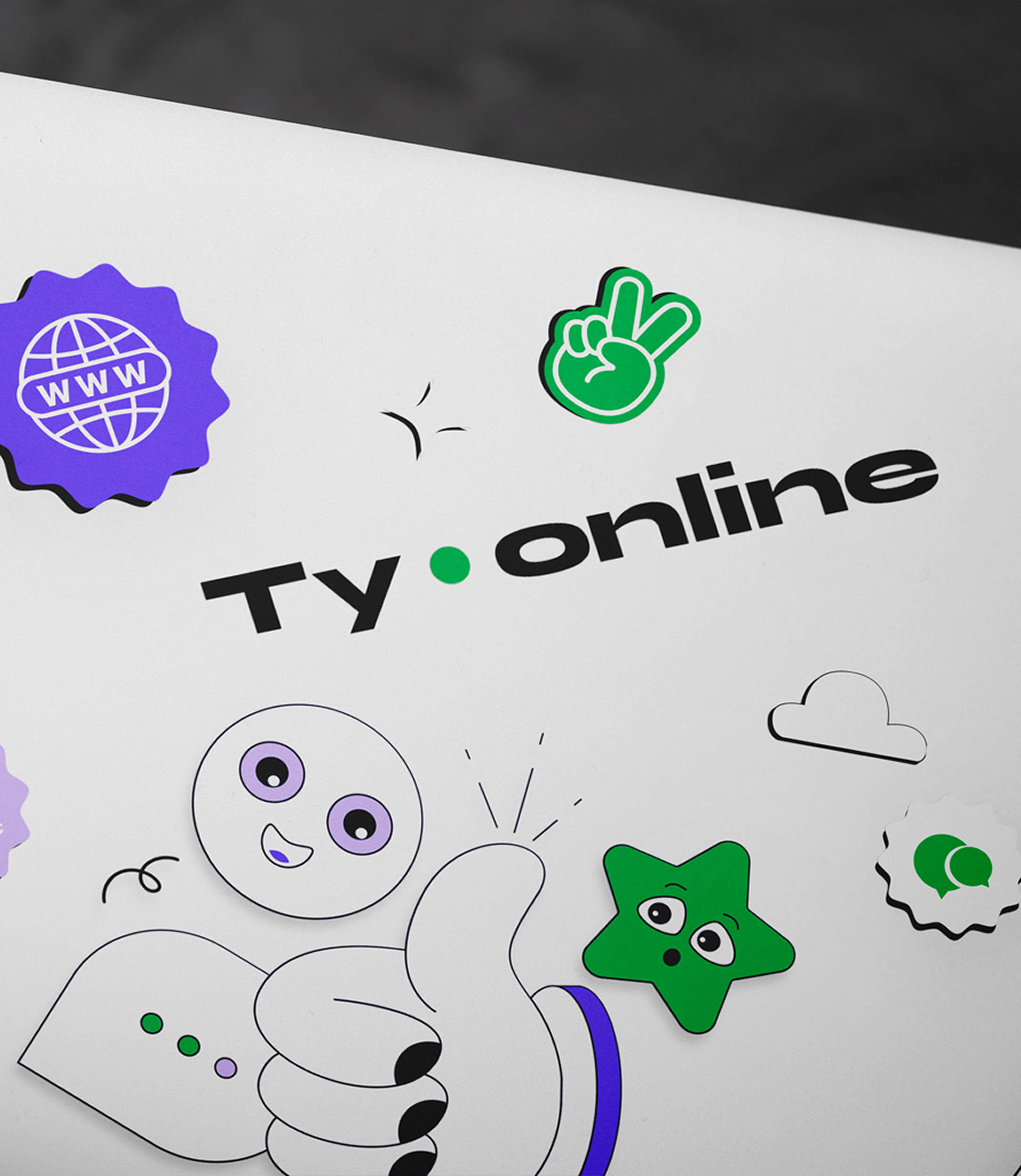
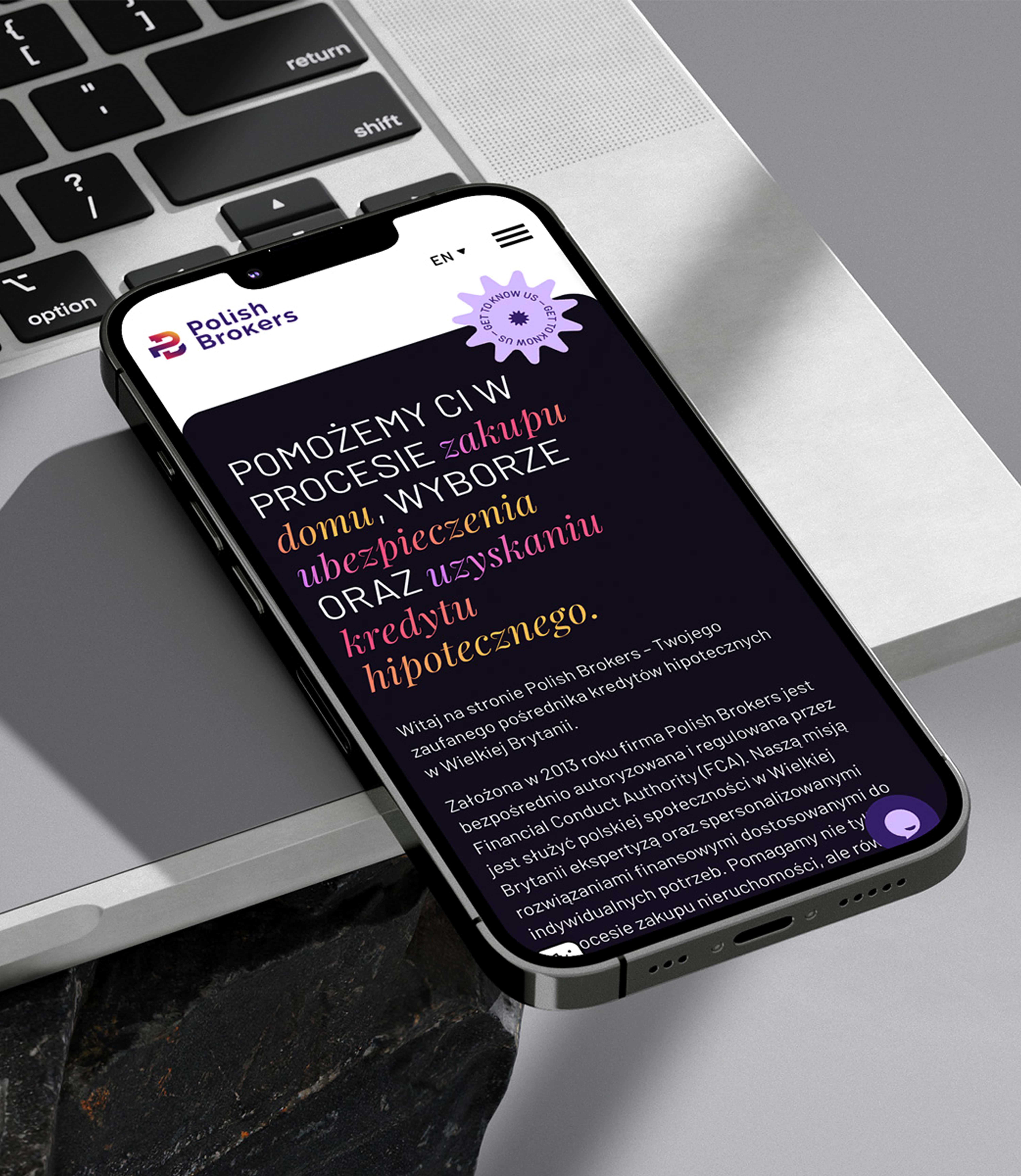
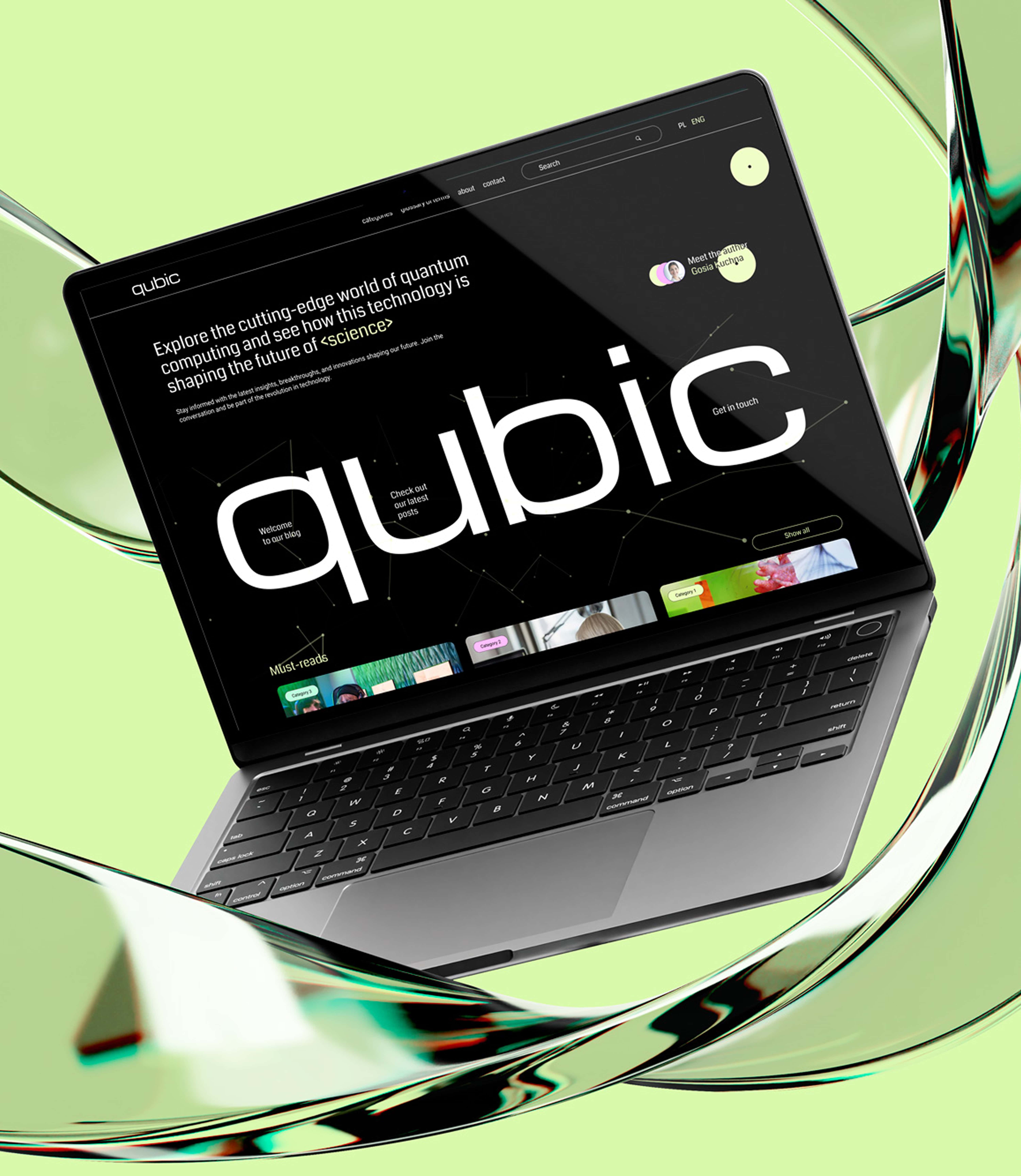
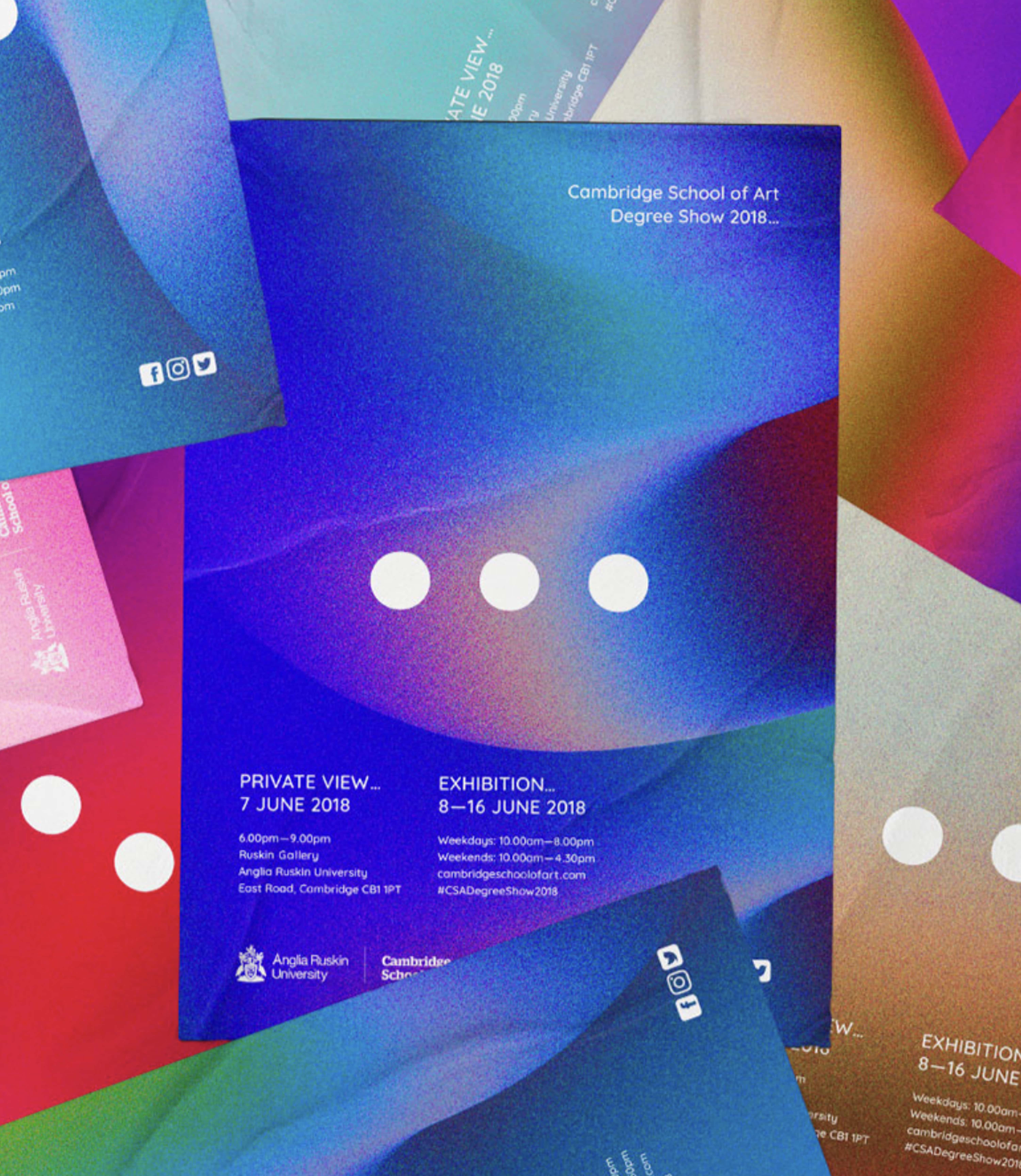
Branding has to work in the day-to-day life of a business. That’s why a professional project should include not only the visual elements but ready-to-use tools as well: templates for presentations, PDF proposals, social media graphics, email footers and company documents.
Without them, even the most beautiful brand book ends up in a drawer, and a week later the business is knocking out graphics ‘on the fly’ in Canva with a random font and a random colour. And the brand looks random again.
A brand book doesn’t need a hundred pages. It needs to be practical. It has to answer ‘how do I do this?’ — not just ‘what does it look like?’. Because a brand is shaped by dozens of small decisions every day. And consistency across those decisions builds trust far more effectively than one perfect photo on Instagram.
In summary: professional branding means brand strategy, a logo, a colour palette, typography, a style for graphics and photography, rules for using the identity, and ready-made tools for everyday communication. The logo is part of that system. Without the rest, it’s just a nice mark with no strength behind it.