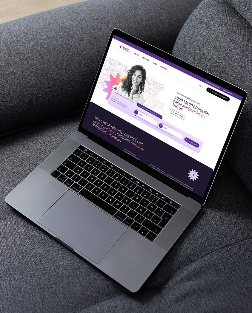
A new language for a financial brand that combines expertise with a sense of security and closeness
Polish Brokers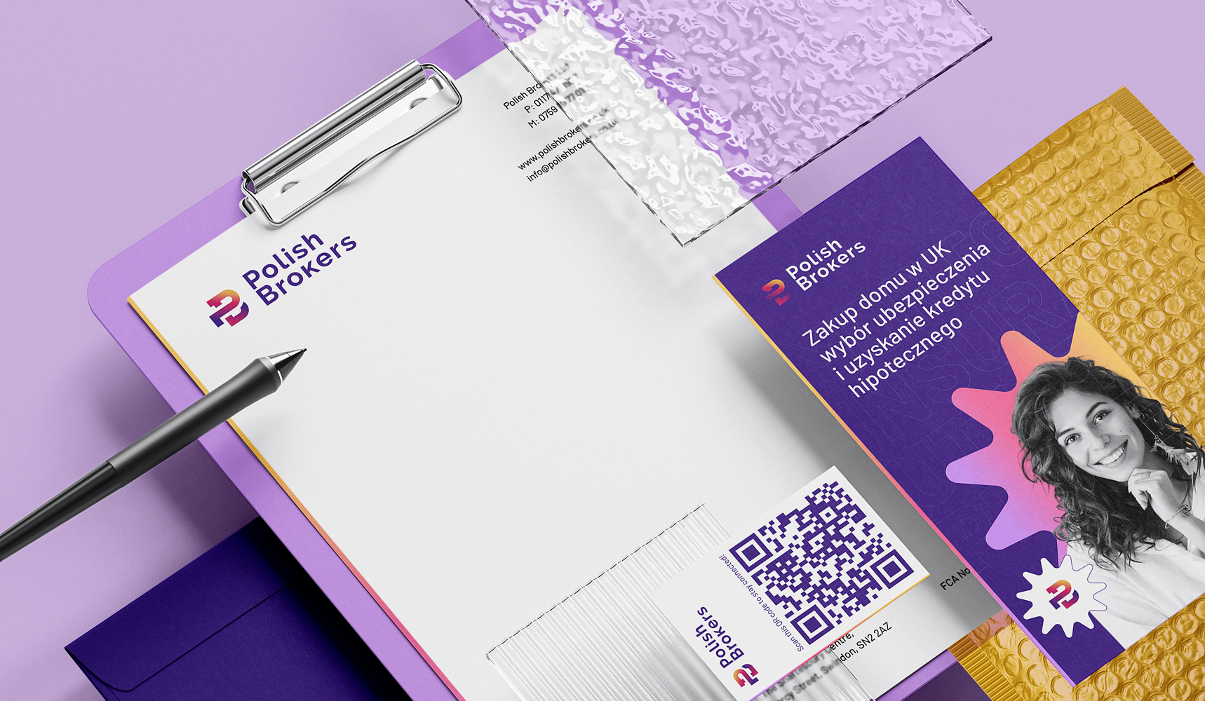
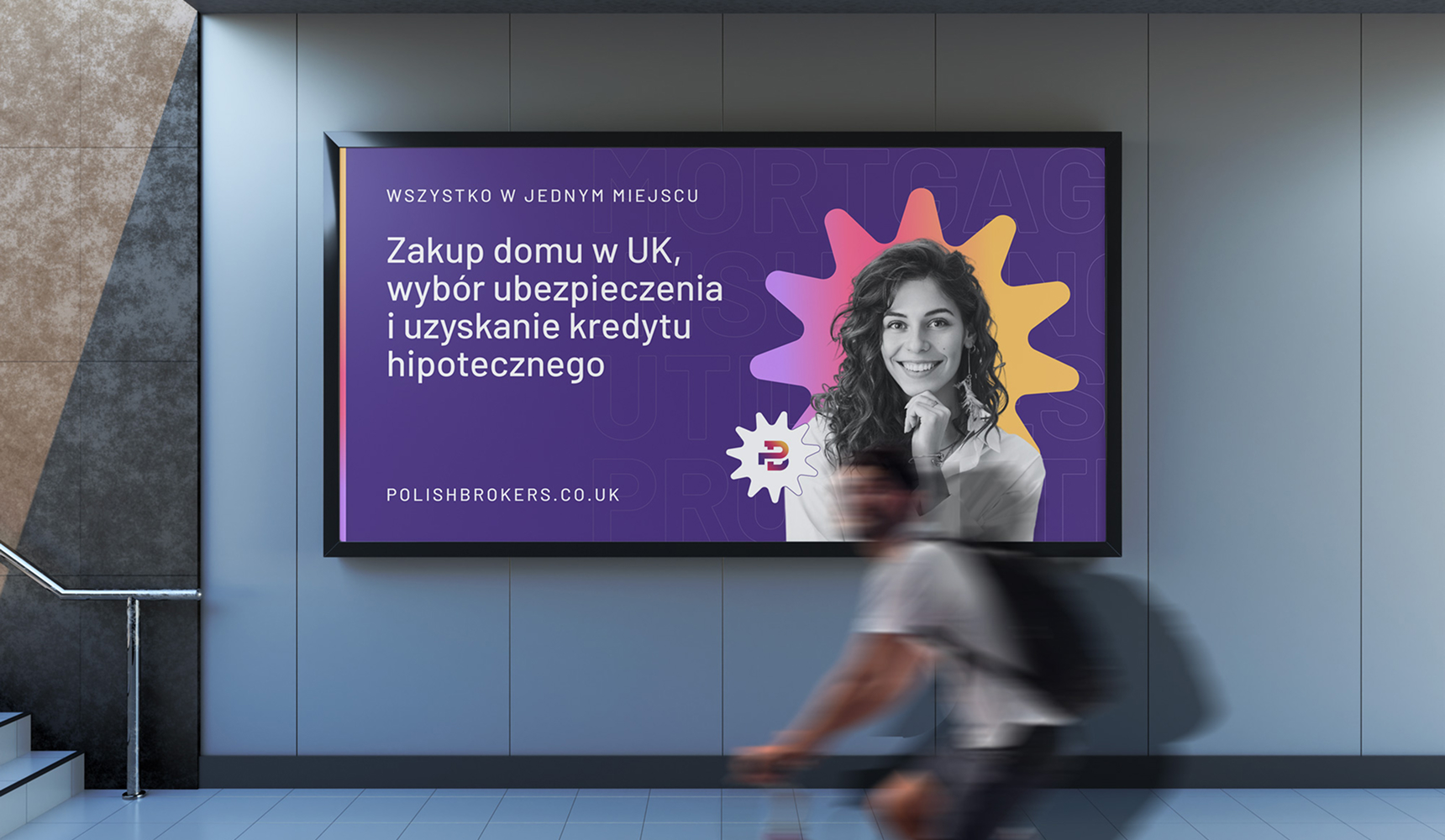
Key visual
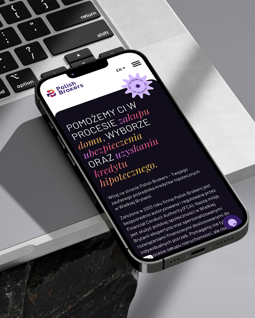
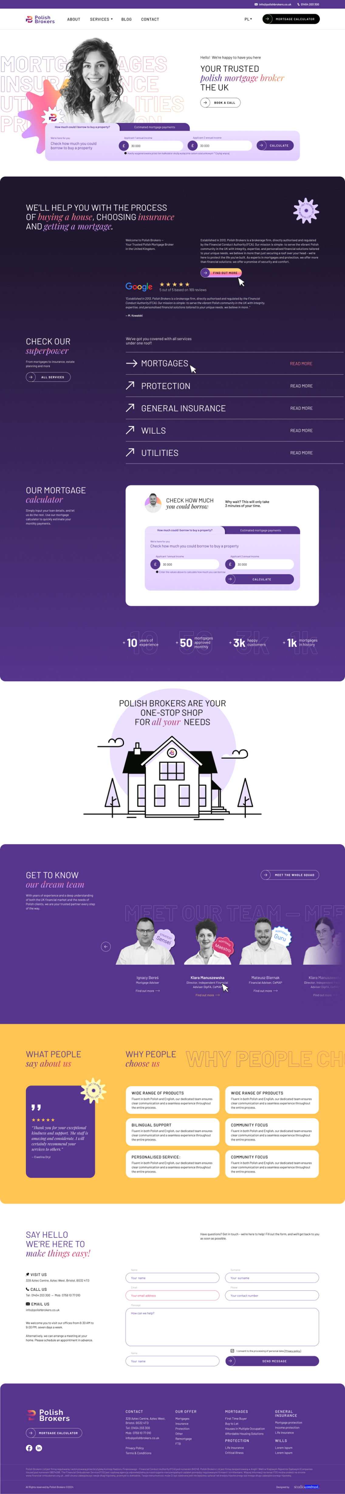
Website
Context
Polish Brokers is a financial and mortgage advisory brand serving the Polish community in the UK, combining expertise with personal support in mortgages, insurance and financial security in the broader sense. The project covered a cohesive brand identity and communication tools designed to turn a complex offer into a clearer, more modern and more credible image.
Challenge
The financial sector often speaks in a cautious, heavy and not particularly approachable language – and with services that demand a high level of trust, that can widen the distance and deepen the client’s uncertainty. Here, the challenge was to build a visual system that kept the brand’s expert character while making it more human, more memorable and more welcoming for clients making one of the most important financial decisions of their lives.
Strategy
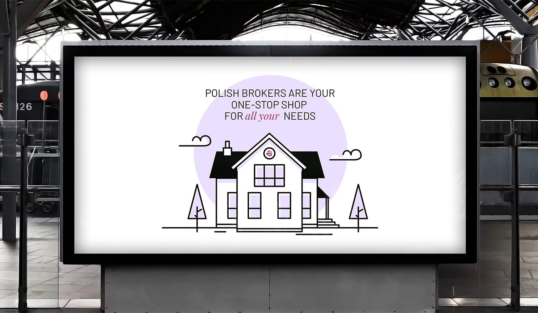
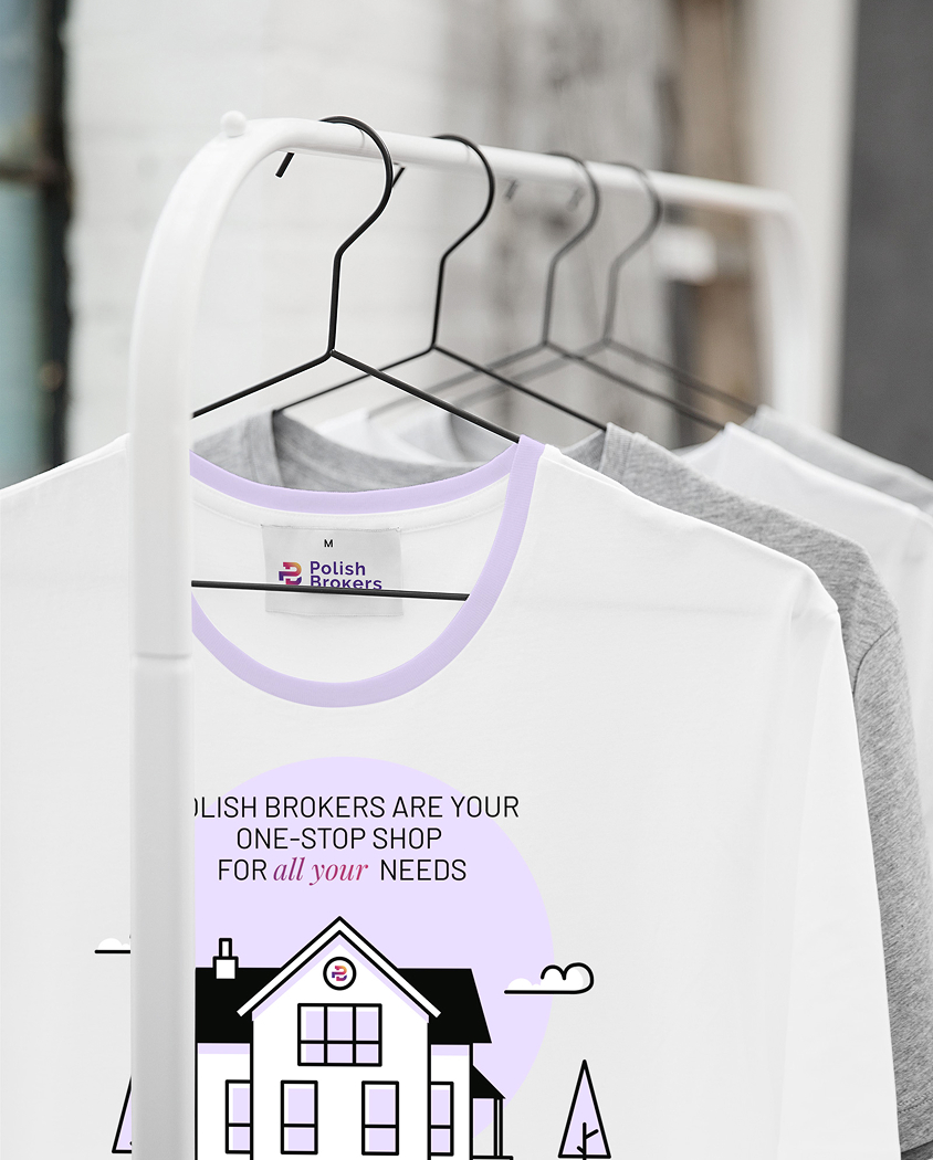
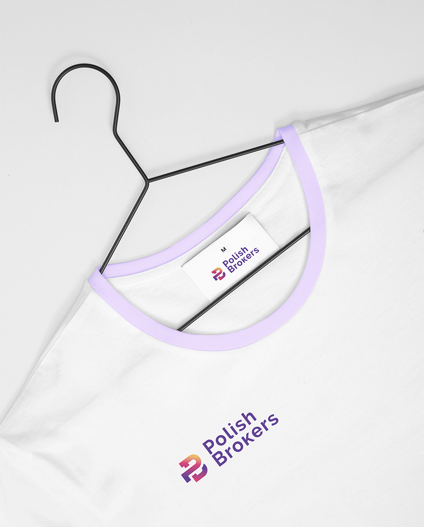
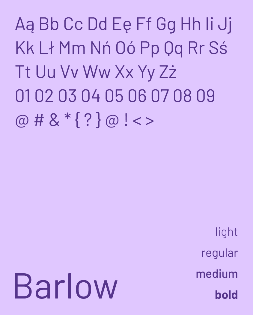
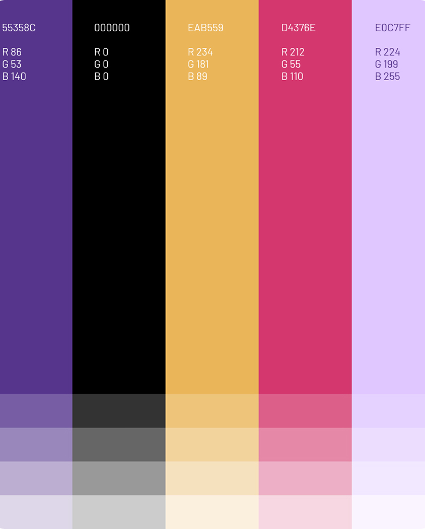
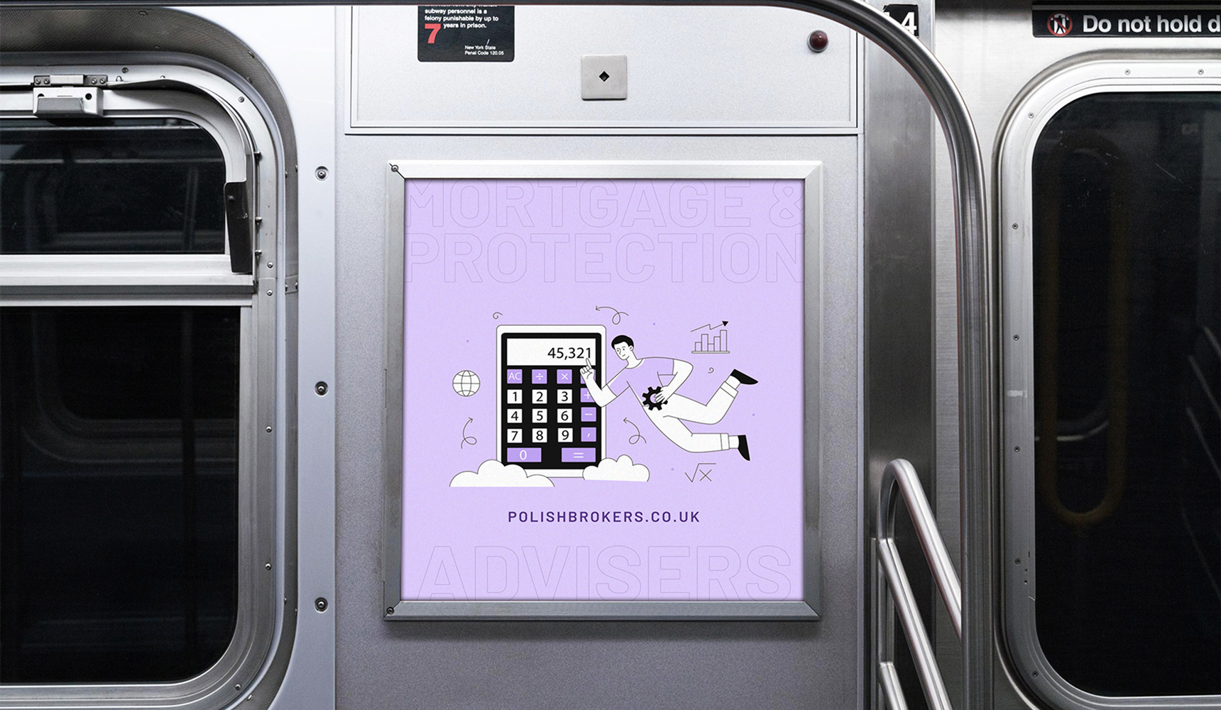
The project was built on a bold yet well-ordered brand identity, dominated by strong purples paired with a warmer accent colour. This direction moves away from typical financial aesthetics and creates a brand that feels more modern, confident and easier to recognise. It is rounded off with illustrative and graphic motifs related to home, security and guiding the client through the process.
Outcome
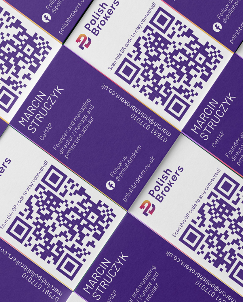
The result is a communication system that brings order to Polish Brokers’ broad offer and gives it a distinct, professional but not overly formal character. The new identity reinforces a sense of trust and competence, while making the brand more approachable, contemporary and better equipped to communicate with clients both online and offline.

‘Studio Contrast isn’t just design – it’s strategy, peace of mind and results. For the first time I felt that someone truly understood my brand and could translate it into a visual language. The website doesn’t just look great – within three months it increased conversion by 347%!’