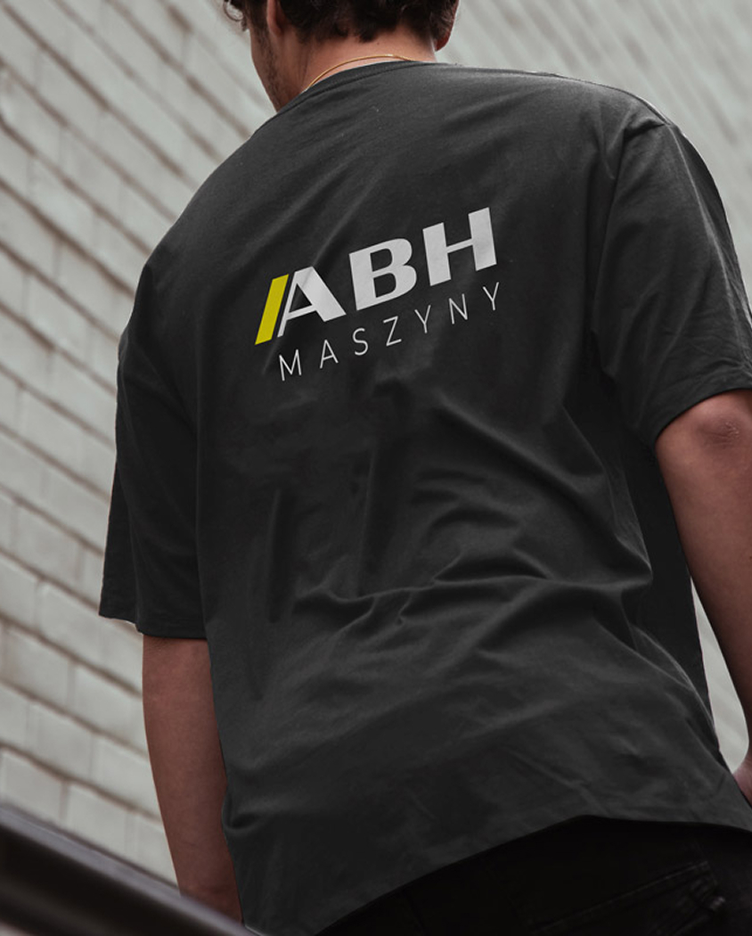
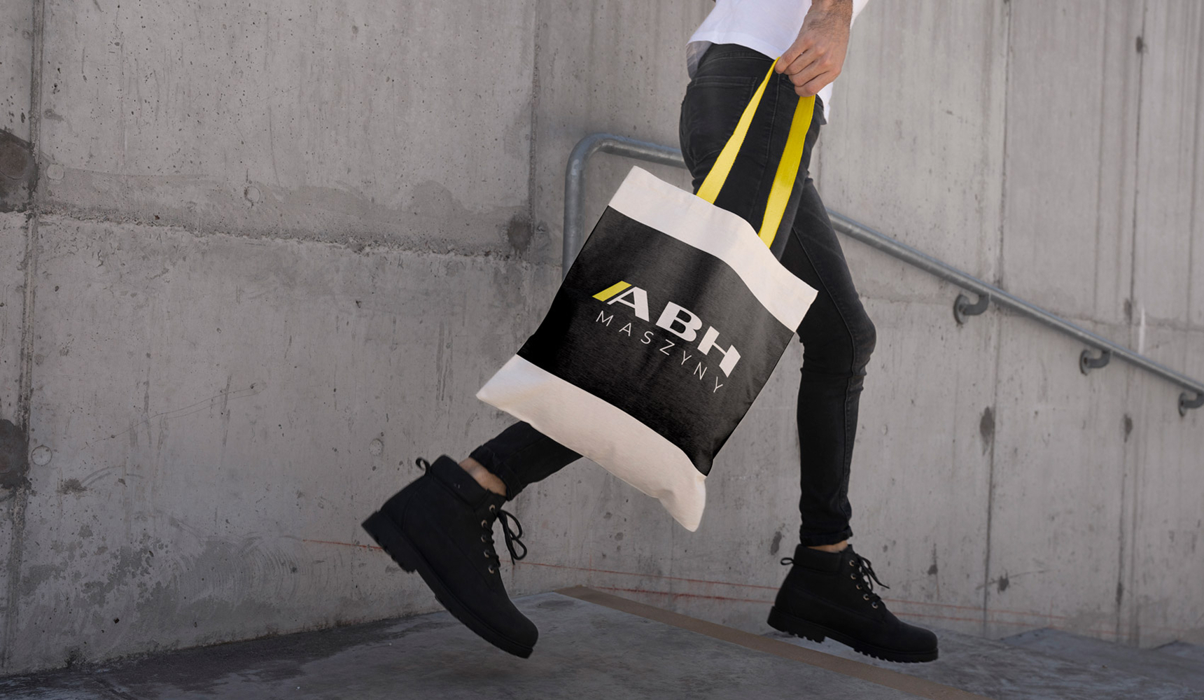
A new visual language for an industrial brand – from logotype and website to a flexible exhibition stand
ABH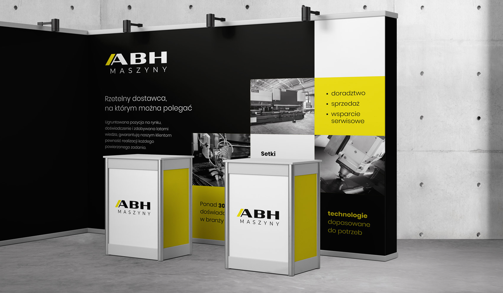
Brand identity
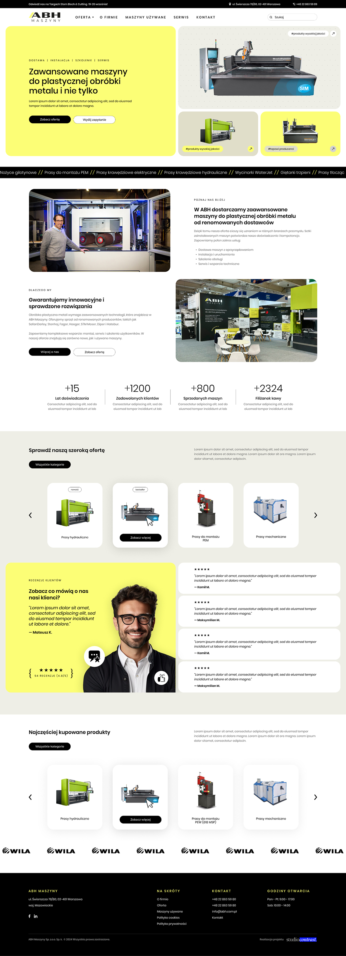
Website
logo
Context
The project covered laying the foundations of the brand, refreshing the logotype, designing the website and creating a new exhibition stand for a company working in the heavy machinery sector. The brand needed a coherent, modern visual system that captured the technical nature of the business and worked equally well online and on the trade-show floor.
Challenge
The existing communication needed tidying up and a more contemporary direction. The challenge was to create a look that married the brand’s industrial character with a modern, clear and professional feel. The system had to work on several levels: in the brand identity, on the website and in a physical exhibition space, where the brand competes for attention in a busy trade-show setting.
Strategy
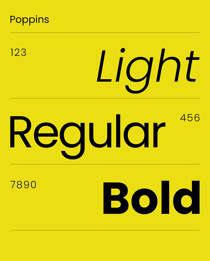
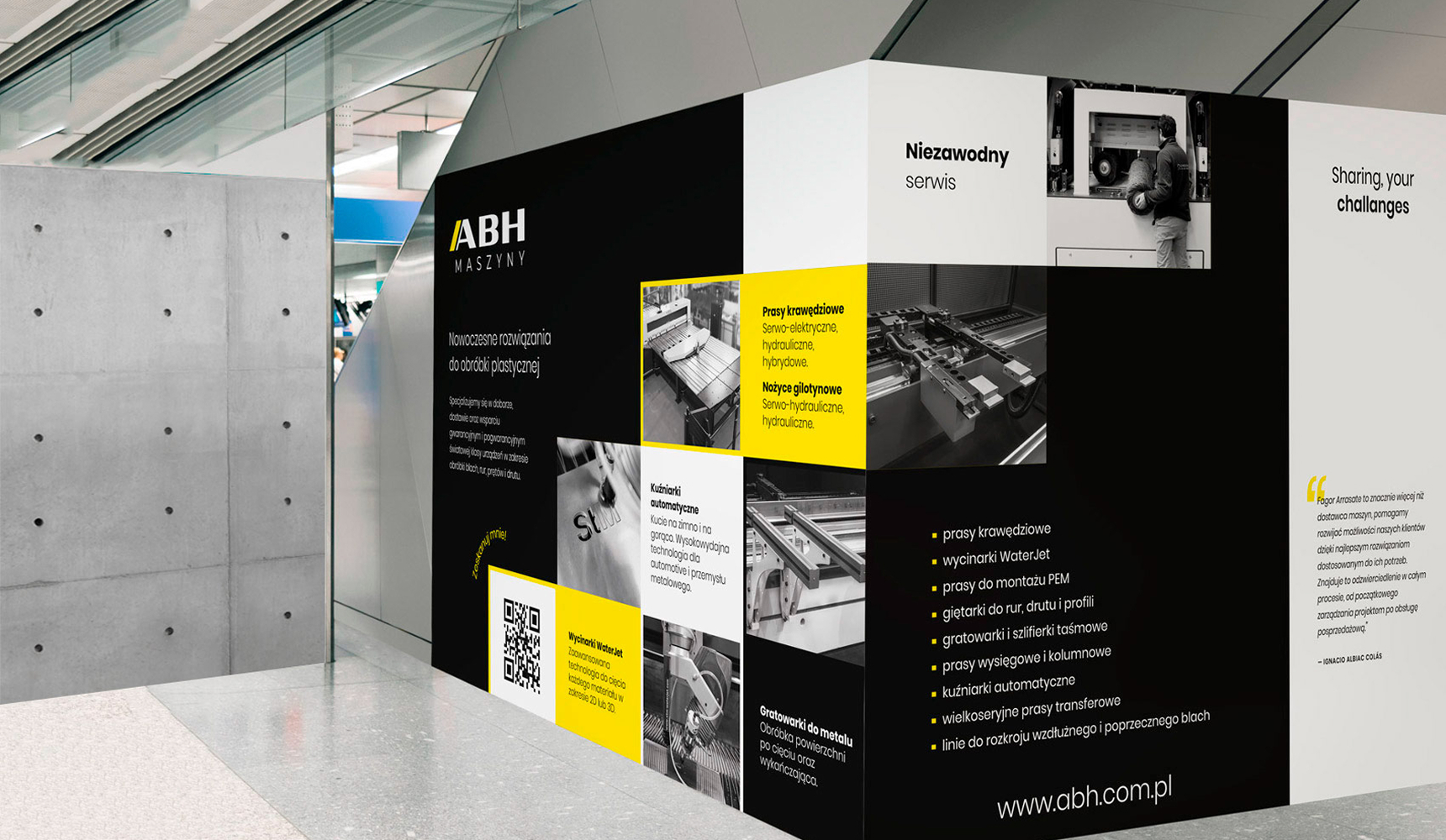
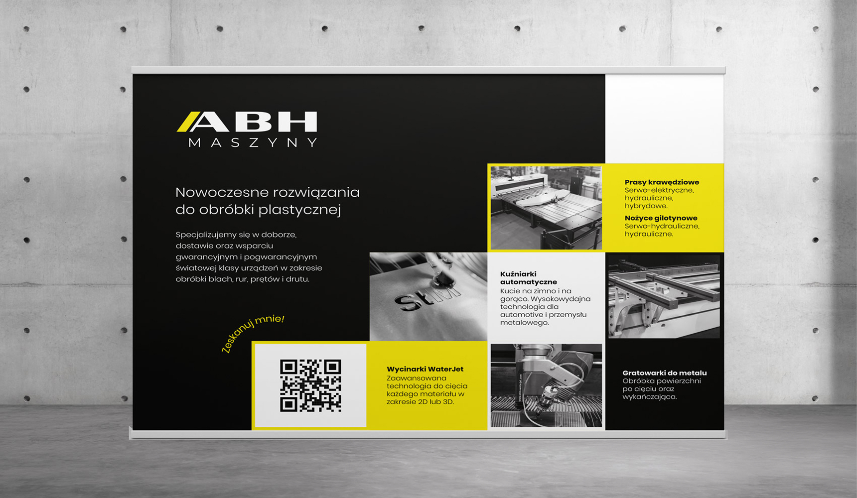
The visual direction is built on a block-based structure, sans-serif typography and a bold, high-contrast colour palette. Black evokes heavy machinery, stability and the company’s technical expertise, while an intense yellow brings energy, a contemporary edge and high visibility. Dynamic graphic layouts were designed to suggest movement, precision and machines at work. The same visual language carries through to the website and a modular exhibition system, giving the brand consistency at its most important touchpoints.
Outcome
The brand now has a coherent visual foundation: a refreshed logotype, a clear identity direction, a new website and a functional exhibition stand. The modular display system lets the company mix and match elements and build stand walls in several sizes to suit each event. The brand has gained a more modern, technical and distinctive image – ready to perform both online and at industry events.